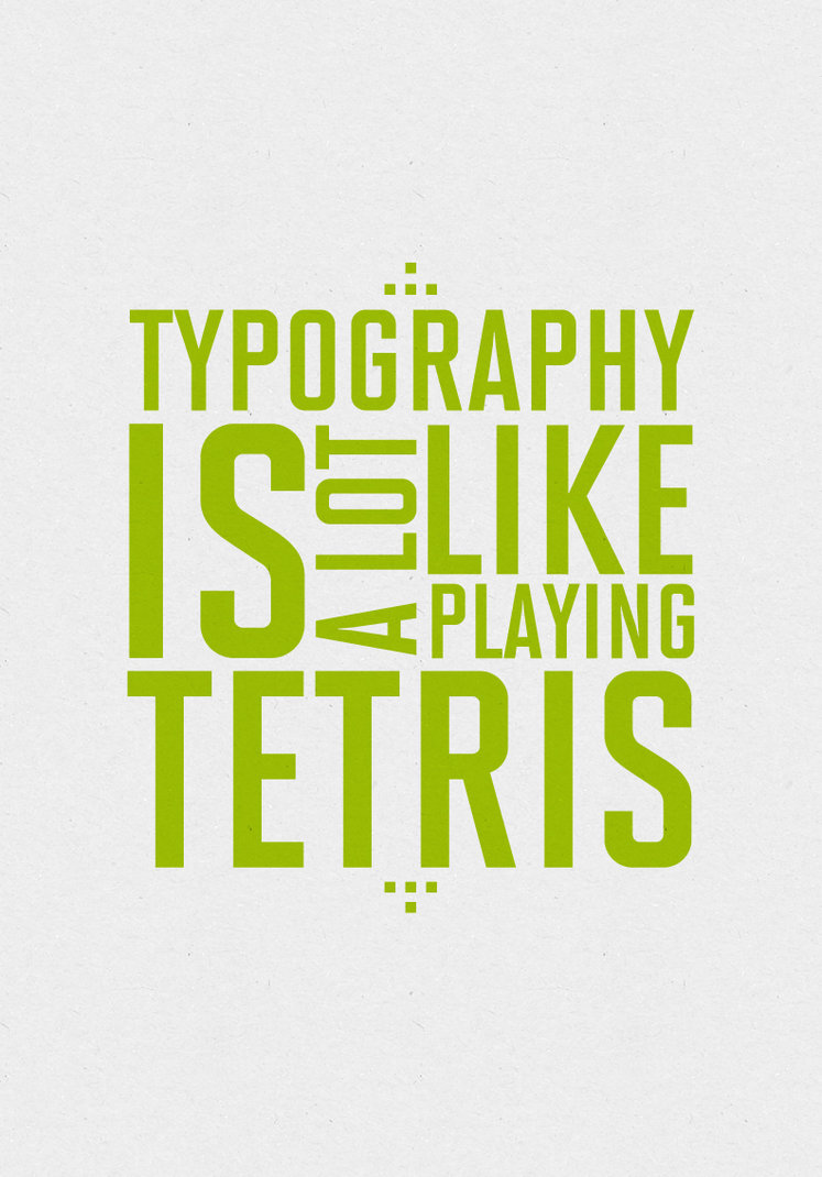
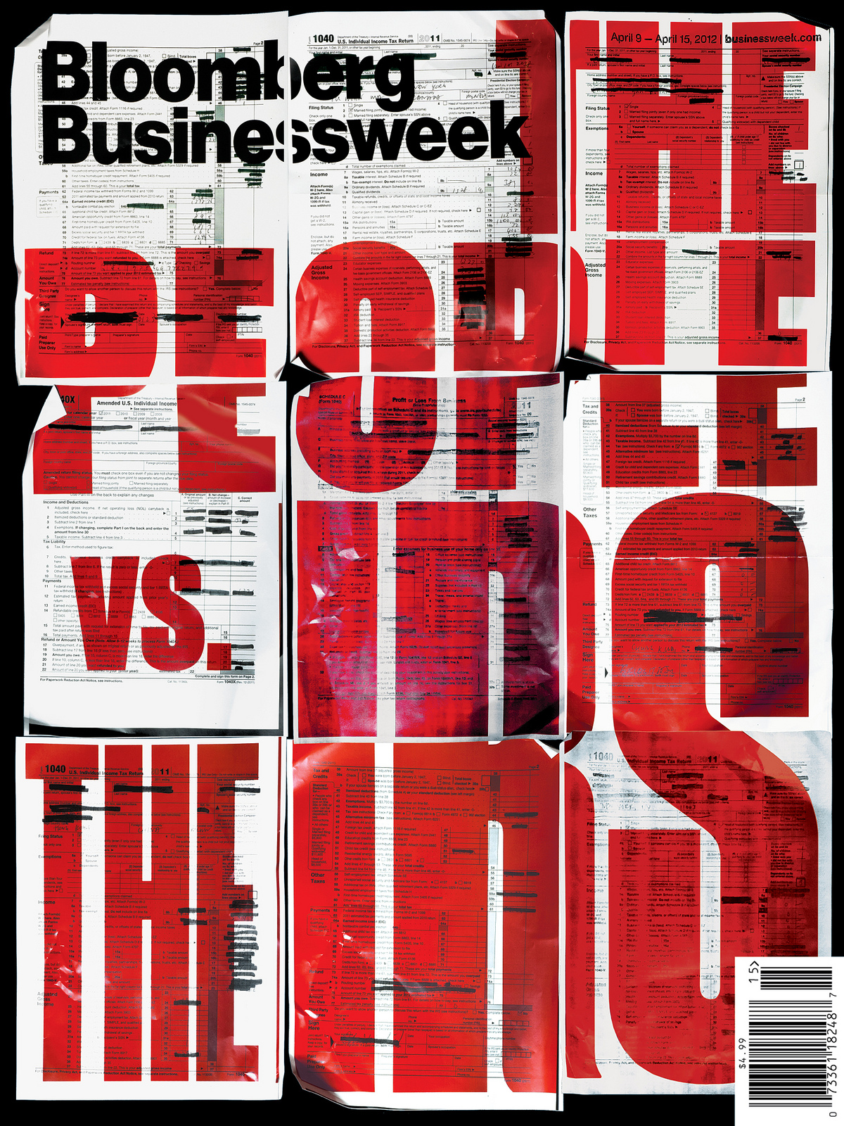
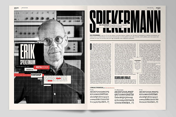
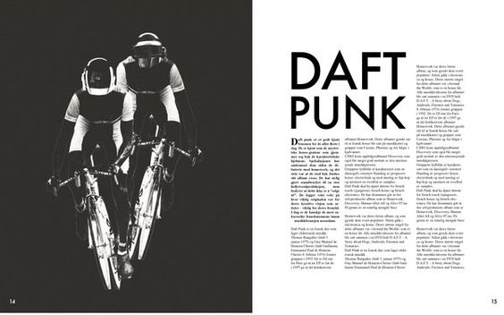
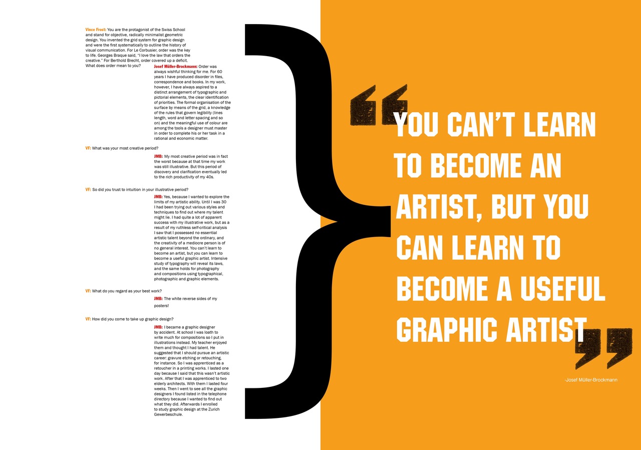
There are existing solutions for creating responsive big bold text. Most reliable so far are JS based.
JS
- big-ideas-text. No jQuery!
- fitText (32 sloc). Use this plugin on your fluid or responsive layout to achieve scalable headlines that fill the width of a parent element.
- TextTailor (165 sloc). Responsive text to fill the height of the parent element or ellipse it when it doesn’t fit.
- slabText (207 sloc). jQuery plugin for producing big, bold & responsive headlines. Implementation of slabtype alogorithm
- BigText (248 sloc). jQuery plugin, calculates the font-size and word-spacing needed to match a line of text to a specific width.
- hatchshow.js. jQuery plugin
If you take a look in source code, you will notice it is not complicated code. But all of them depend on jQuery. So it will introduce ~50kb of JS dependency for such simple functionality. Possible solution of this problem:
- use lighter jQuery alternative
- implement same functionality without jQuery dependency
- implement using Houdini (when it will be ready)
SVG
There is SVG only implementation of functionality similar to fitText. And JS plugin which make use of this SVG trick.
Other notes on SVG text fitting:
CSS
There is a solution to make text to fit to viewport, but not to fit container. See also this discussion on stackoverflow.
Line breaking algorithm
Line breaking, also known as word wrapping or paragraph formation, is the problem of dividing a text into a sequence of lines so that every line spans at most some fixed width.
- TeX line breaking algorithm in JavaScript
- Line breaking
- A JS implementation of the Unicode Line Breaking Algorithm (UAX #14)
Hyphenation algorithm
A hyphenation algorithm is a set of rules (especially one codified for implementation in a computer program) that decides at which points a word can be broken over two lines with a hyphen. For example, a hyphenation algorithm might decide that impeachment can be broken as impeach-ment or im-peachment, but not, say, as impe-achment.
- Franklin M. Liangs hyphenation algorithm (LaTeX and OpenOffice) in JavaScript
- Soft hyphen
- Non-breaking space
<nobr>- CSS Hyphenation
Usage
Titles, quotes, pull-quotes.
